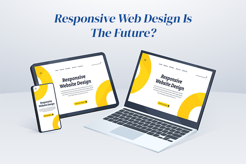
Responsive Web Designs gets lots of attention in today’s World. Defiantly I can say that yes it is the Future of web designing. How this is different from the other website designs, in which way it’s different that I’ll describe you below.
What is Responsive web design?
Day by day, the number of devices likes iphone, ipad,Tablet, netbook, blackberry, platforms, and browsers that need to work with your site grows. Almost every new client wants a mobile version of their websites. All screen resolution must be compatible too. Responsive Web design is an approach whereby a designer creates a Web page that “responds to” or resizes itself depending on the type of device it is being seen through.
Responsive Web design has become one of the hottest trends in 2013. This is due in part to the growth of smart phones and other Mobile devices. More people are using smaller-screen devices to view Web pages.
How different it is from the “traditional” way of designing websites, it can be a bit overwhelming for those designers who have yet to try it.
When we viewed our designs in the desktop computer we show in three columns but the same website we can view in our small mobile device or tablets we can see difference. Sometimes users do not like it. Even when we forced this design to horizontally that time its look veered. Sometime some part might be hidden and destroyed.
The impact is also complicated by the fact that many tablets can be viewed either in portrait orientation, or turned sideways for landscape view.
Client and User’s always have same questions of the designs like
- Is this work on every browser?
- If I’m using the old outdated browser than I have to choose to ignore?
- Do I have to check the version of that browser to check that which one do I care to support ?
But now We can have the solution of all questions with the use of Responsive design. So I can say that if the developer is not using yet the Responsive designs than they should try it.
Build for Future, Not only the present
Most advantage of responsive design is that it doesn’t focus on the devices and sizes.Because the responsive design is fit in any of the size. So we can say that its future friendly.
Well one thing is that choosing to go with responsive is purely depending upon the some of the factors. That should be considering before making decision. For example, if we want to design the blog with simple information and content than we should defiantly go with responsive designs. But some time we brand the heavy site and detailed content than we should think for it. When moving from desktop to mobile devices.
Sometimes even a mixture of the both responsive for desktop and tablet and then moving to a custom designed mobile site for your phone is the better solution. End of day you are really striving to just give your client the best user experience possible, Whether responsive design is the future or not.
Sigma Solve is to give our clients best solution to help grow their business and continue our clients on the best application possible.
Sigma Solve Inc. recognized by CIOReview Magazine as 20 Most Promising Mobility Consulting Companies in 2014.


